BMR's Step-by-Step Balrog
Balrog Step-by-Step[edit]
Righto, so I thought I'd do a step-by-step for how I do my pixel art. Now, I don't claim to be an expert on the subject or even anywhere close to being an expert. In the same vein, this is hardly a be-all-end-all guide to doing pixel art. Further, I'm sure that a lot of the more experienced and more skilled pixel-ers out there will probably spot more than a few errors, mistakes, and whatnot in this little guide. That said, this is just one way to go about pixel-ing a sprite. It's how I go about things, and I offer it for whatever good it may do. I'm more than open to any suggestions for improvement, and always welcome any tips to improve my work.
So without further ado, here's my Balrog step-by-step guide.
Step 01 - Draw the outline[edit]
The first step is obviously to get a basic idea of what you want to draw.
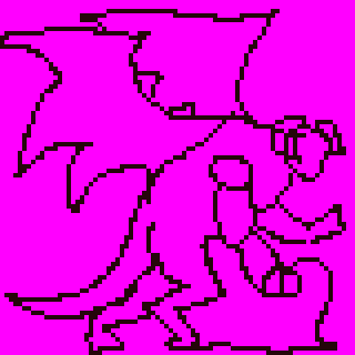
As you can guess, this particular guide focuses on a balrog. While you can certainly draw this off the top of your head if you're good enough, looking at a reference is a good idea to give you an idea of structure, angle, etc...
You can also draw the basic outline on paper and then scan it into your computer. As my scanner is currently dead and my pencil skills are pretty shabby, I don't go this route and instead just draw directly on the computer. There is no "best" method here, so go with what works for you.
Step 02 - Fill the base colors[edit]
Next, I fill in the basic color that will make up the majority of the figure.
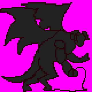
At this stage, I find it best to stick to a single color. The color is typically the base color upon which everything else is based off. In this case, I'm going with a dark gray as balrogs are beings of "shadow and flame". The "flame" part will come later, for now I'll focus on the hide of the balrog which I imagine to be something of a cross between black volcanic rock and very thick and very hard leather.
Step 03 - Add basic highlights[edit]
Next, I add some highlights.
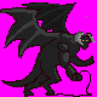
These are where your lightsource hits your figure. I find it a good idea to go ahead and draw a little arrow to show where the light is coming from. I haven't done that in this image yet though, because I'm a lazy bugger. For now, I don't typically worry about shading. I just lay out where the light hits and I'll worry about blending things together later.
I've also added some basic structure to the balrog's wings because the same color is used for the bone structure visible in the wings as is used for the highlights on the flesh. I've also added eyes to give me a point of reference for the angle of the head and body. The horns have also been given some very basic shading, just to provide myself a visual barrier of sorts between the head area and the body.
Step 04 - Add basic shadows[edit]
Just like above, this is just some basic laying out of colors.
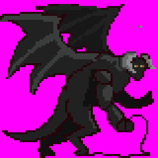
The darker areas hidden by shadow are added here. This is also affected by the direction of your lightsource, so keep it in mind. Again, I haven't added the arrow yet, though I should have.
Step 05 - Smooth out shading[edit]
Next, I smooth out the shading I've done in the previous two steps.
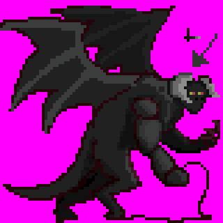
I've also added the arrow showing me where the light is coming from. I find that it helps me while shading and blending things. I should have added it earlier, but oh well.
Step 06 - Refine shading[edit]
Here, I'm further refining the shading and adding some more contour onto the more visible areas (i.e. the arms).
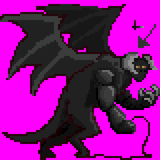
The red outline used previously is mostly gone on the right arm now and claws have been added to the left arm. Right now, the right arm looks like a bunch of shiny black segments on a caterpillar or something. It'll be refined later on and it won't remain some sort of bizarre balcrab or something.
Step 07 - Refine structure, add more color[edit]
I wasn't satisfied with part of the structure, so I further refined it.
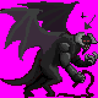
The tail in particular has been shifted to provide a bit better definition for the left leg. I've continued refining the shading here, and I've begun work on the wings. The outlines are gone, and the wings has been temporarily made purple. I've also changed the structure of the bones, as I realized how anatomically incorrect my previous drawing was.
I've also refined the head a bit, giving him a bit of a beard. A complete departure from Tolkien balrogs, but I like the look and feel it make it look more traditionally demonic.
Step 08 - Define wings[edit]
Like the body in previous steps, i've begun defining the wings.
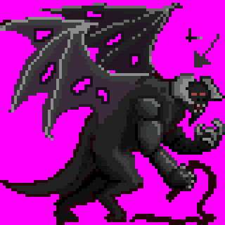
i've gotten an idea how the light affects the bone area and what sort of structure the wings are going to take. Right now, I've only added some basic highlights.
I don't want the balrog to be too pristine, so I've added some holes to the wings. It's a big creature in cramped underground areas. It's lived for centuries and it's primary purpose is to fight and kill things. I'm sure it's managed to take some damage in that time, so I've made the wings a bit tattered to reflect that.
Step 09 - Detail wings[edit]
Here, I've started detailing the wings. Yeah, I know, it's a bit of a large step from the previous one, but I got a bit caught up in the work and forgot to create a separate image.
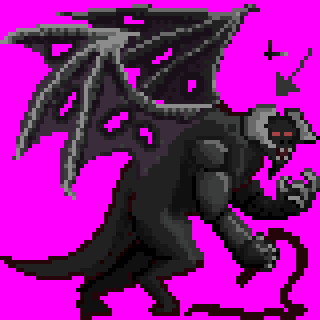
In order to keep the color count down, rather than grabbing another shade of gray, I've dithered some previous shades into the bone area. The holes surrounding skin around the holes in the wings have also been further darkened. As you can see in the right wing near the body, I've also begun adding a few spots here and there which will eventually lead to texturing of the wing.
Step 10 - Refine structure, add more shading[edit]
Now that the wings are done for now, I've gone back to the body to refine the shading.

In the previous steps, the legs were awkwardly short and connected to the body at a strange angle. I've fixed that here by giving the balrog much longer legs. I took inspiration from a picture of a tyrannosaurus rex to get the proportions the way I wanted them. The outlines are by now mostly gone and have been replaced by appropriate shading.
Step 11 - Change wing color[edit]
As I've now gotten the basic structure and shading of the wing that I want, I've changed the color back to gray.
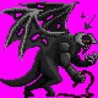
Some tiny changes to the shading and structure were also done, but not much. Right now, the basic rough shading has been done. You'll notice that the tail and legs are much less detailed than the arms. I've done it this way because the arms will be focused on more as the shadows cast by the body and the arms will leave much of the legs and tail in shadows. Because of that, I can get away with less detail on them.
Step 12 - Begin texturing[edit]
Now, I start to texture the flesh.

What texture you apply will depend on the surface of your subject. Smooth baby skin will be extremely different from hard granite. I find that finding and studying a material that's close to what you want works rather well. Even if it's pixel art and thus very limited in what sort of texturing you can get, you will still be able to apply some measure of effect to it.
Here, I've shadowed small and rough cells on the flesh. This is supposed to mimic broken and battered rock. The cells are more loosely spaced in areas that are hit by light, and more densely packed in areas in the shadow like just behind the arm.
Step 13 - Continue texturing[edit]
Here, I continue shading the flesh of the balrog.

I've added some more midtones to the shadows, and I've started to better define the cragginess of the flesh. The lighter areas that hadn't been too affected in the previous step have begun to be more detailed here.
Step 14 - Continue texturing[edit]
Some more texturing is done here, mostly darkening and better defining contours.
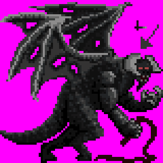
Here, I've added some more dark shades to better contour and round out the shape of the body. Compared to previous steps, the legs are more well-defined and rounded. The arms too (particularly the triceps) have been darkened to show the contours better.
Step 15 - Start cracks[edit]
Now comes a difficult step, adding the cracks where the magma and heat escape through.

I decided to go with the Jackson image and have cracks appearing all over the body where the inner heat would seep through. To start, I've added some basic red shades over the body where I want the cracks to appear. Right now, they're fairly dark, but later on I'll be adding shades of yellow and brighter reds to show the heat and fire.
Step 16 - Blend cracks[edit]
Here, I've blended the cracks into the flesh a bit more.
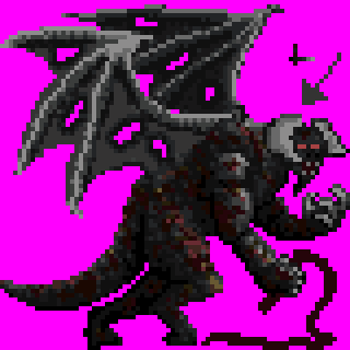
I did this by adding more shades of yellow and red to blend into the dark and light grays of the flesh. The lighter shades would, of course, be found more on areas in light, where they would blend into the darker reds covered in shadow.
Step 17 - Refine shading[edit]
This is a small step, mostly, I've just further blended the colors into the grays.

Some of the more glaring bright areas have been darkened as well. I've also reduced the colors somewhat, in order to keep the color count down. The previous step had 17 colors, one more than is allowed. This step only has 16 colors, right at the correct limit.
Step 18 - Refine structure, reduce colors[edit]
Here, I've further reduced the colors from 16 to 15. This is in preparation for adding the flames to the body which will definitely need some extra colors.

Some changes to the anatomy have also been applied, most obviously in the legs. In previous steps, the legs didn't look very leg-y, and while they could be seen as two legs, it wasn't as obvious as it should have been. To fix that, they've been shifted forward to a position that would more realistically stand under the body's center of gravity.
Further shading has been done to the horns and wings to provide some more texture.
Step 19 - Add flame base[edit]
This is the fun bit, adding the fire.
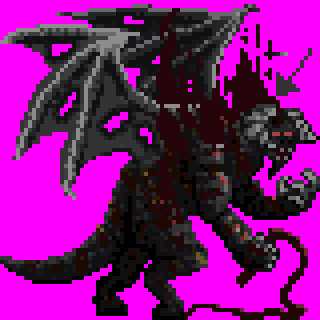
To do that, I splashed some rough shapes over the body and around the head area where I want the flames to appear. They're currently a solid red, for the same reason that the body was initially just a solid gray. This gives me an idea as to the structure of the flames and where they're going to appear. Later on, the yellows, oranges, and other shades of red will be added.
Step 20 - Start blending flame[edit]
The yellows have been added to the tips of the flame where I feel they would logically be. Now, fire can be a tricky thing to draw, so it takes quite a bit of trial and error to get things just how you want them to look.
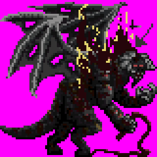
I chose to start from the tips and work down to the base to give me a better idea of the number of colors I'd need. This gives me a hard limit as to how many new colors I can introduce to the sprite. If I started at the base and worked progressively up towards lighter colors, I might very well go over the limit in my enthusiasm to get things looking just right.
Step 21 - Continue blending flame[edit]
Here, I continue blending the flames.

Some light reds have been added, two shades specifically. Technically though, only one extra shade was added, as some of it was already used for the eyes.
Step 22 - Continue blending flame[edit]
Yet more blending here.

The shade added to the flames is the same as some of the lighter reds that appear on the cracks on the body. That way, I'm not introducing any new colors.
Step 23 -Refine outline and shape[edit]
Here, I've refined the outline of the sprite.
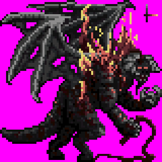
Typically, I'm not a fan of solid black outlines on sprites. It does look good though, and it works well with some sprites. I prefer to not use it though, and instead use different colors/shades where I find them visually appealing. Then again, I could be mistaken in this belief, and I hardly have enough experience to know what works best. I can see the appeal of both methods, and my opinion is still subject to change on the matter.
Step 24 - Refine shading and structure[edit]
There were still a few areas that needed some refining, so I've gone back and fixed those.
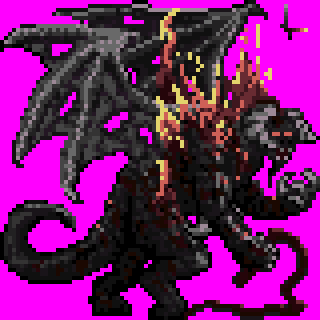
The tail has also been lengthened as I felt it was a bit too short previously. Some more outlines have been added where I felt them appropriate.
The arms are now also sporting spikes the elbow. Another departure from the traditional balrog image, but I like it.
Around this point, I see what details can be added. I looked at the arms and felt that they needed some more definition to them, so I tried to add some corded muscle. Same goes for the legs which were a bit too bland and lacking in structure.
Lastly, I've also changed some colors around, eliminating some and replacing them with others.
Step 25 - Finalize[edit]
At this point, I step back and look at the overall image to see what else I can add or refine. I noticed how silly the feet look and changed those to not look so silly.
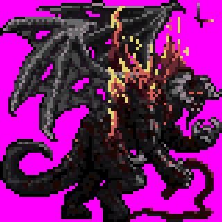
a bit more outlining has been done on select areas. The horns also now have more of an upturned point to them which was missing previously. The thumb of the right hand has been refined to make it look more like he's holding the whip.
And that's all for my little guide. It's not the best, but I hope some people will be able to find some use in it. Here's a GIF showing the progression of the image:

And that's all for now, BMR out!