BMR's Portrait Tutorial
BMR's Legacy Portraits, Step-by-Step[edit]
So, I've decided to do a step-by-step for the portraits I've done for Legacy. Like my other step-by-steps, this is not a be-all end-all to how to do graphics. Rather, it's just hte way that I do them, and as previously, I offer this as one look into how one artist does things in the hope it might help others. So, let's get started.
Step 01 - Find your image[edit]
The first step, of course, is to find your base image. You can use pretty much anything, stock photos (there are many sites where you can get images), shots of friends and family, 3D renders, or if you've got the skill, from images you've drawn/painted yourself. One note though, if you plan to make money from your game, you'll want to make absolutely sure about the usage rights of whatever photo you're using (one reason I decided to scrap the old portraits, but that's another story) so as to avoid any headaches down the road. Of course, if you're drawing them from scratch or are using your own 3D renders, then that's not something you'll have to worry about.
For this particular step-by-step, I've decided to use a render I did in Poser. So that it wouldn't look too obviously like a stock Poser model, I spent some time tweaking the face, applying morphs, etc... to get the shape of the face that I wanted. I didn't, however, bother too much with the body, as most of it won't be shown anyway. The initial render is below:

You'll want something with relatively high contrast, so as to make the process of scaling down and defining features easier. Of course, as we're going to be editing it later, that's less of a concern. However, if you're working with photographs and have done any sort of image processing previously, you'll know there's only so much you can do with a photo without repainting large sections of said photograph. And if you have to go that route, and if you have the skill to do so, you might be better off going ahead and painting the thing from scratch. In this case though, the render came out well enough for my purposes, so I'm happy.
Step 02 - Figure out what you want to do[edit]
Before you get started on editing, figure out what you want the final product to look like first. It'll give you a clear path as to where you're going, what you need to add, and what needs to be done. In this case, I've already got a preexisting portrait (generated from one of those online face-maker things, which I've completely abandoned in favor of this method, but again, long story) so I know what it's supposed to look like. Unfortunately though, the base image I'm working with is a very, very long way off from the final image.

That's fine though, as the entire process will eventually get the base image to something that resembles the original enough that it's possible to tell that they're both portraits of the same person, albeit drawn rather differently.
Step 03 - Scale down to mid-res[edit]
Right now, my raw image is 797×729, far too big to work with when I'll be cropping and scaling it to 64x80 anyway. Sure, I could render in some really great detail, like drawing all the pores, getting all the strands of hair just right, adding a lovely little twinkle to the eyes, etc... but it's far too much work for far too little benefit. It's important to keep in mind that the final product will still be pixel art, and there's only so much detail that you can get into pixel art. For this image, I've cropped the image to the appropriate dimensions and scaled it down to 200×250.
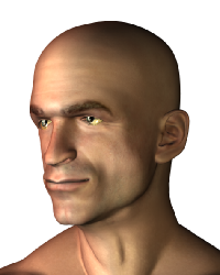
Now, the exact dimensions aren't really all that important. You could work with smaller resolutions, or even higher ones. The reason I've settled on 200×250 for my painting resolution is that it's large enough to allow me to paint things with ease, but small enough that it gives me a decent idea of what sort of detail I can put in and what I need to leave out. Further, the scaling down process later on goes much more smoothly from 250×200 to 64×80 than from 2500×2000 to 64×80.
Step 04 - Get some basic shadows and highlights in[edit]
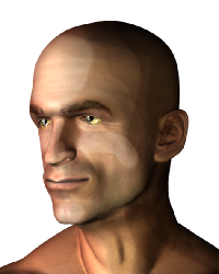
At this stage, I go ahead and slap some basic shadows and highlights in. I deliberately make them rather sharp and high in contrast, as the high-contrast colors show up much better once scaled down and are easier to differentiate once I'm reducing colors. I do this with the burn/dodge tool and a rather large brush at low hardness. This gives me a smooth blending of the colors, while reducing the amount of work that I need to do. Further, if you've got a graphics tablet, it makes this step (and the other painting steps) much easier.
Step 05 - Lay down your flats[edit]
The next step I typically do, is to paint in the hair. Sure, the current guy could possibly pass as Lex Luthor or Prof. X, but the guy I'm meant to be drawing has a full head of hair and a rather messy stubble. The first thing I do is to lay down a very basic flat for the the hair. It looks absolutely horrible, but it'll eventually turn out good-looking (or at least, I hope it will).
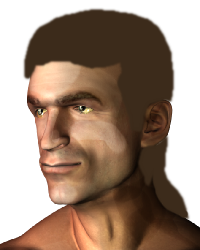
Contrary to how I normally paint, when doing these portraits, I always have the hair on a different layer. This is to make life easier later on when adding the strands of hair, shading them, and copy-pasting anything that needs to be copy-pasted.
Step 06 - Draw the hair[edit]
Next step, draw the hair in using whatever method you prefer for painting hair. For me, I use a pressure-sensitive tablet (well, granted, most tablets are), a special custom brush in the GIMP, and a combination of the brush tool and the dodge/burn tool.

After painting:
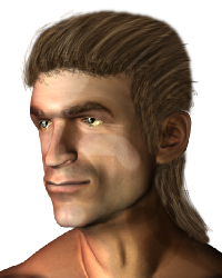
At this stage, the hair still doesn't look like much. If I were actually painting this for high-resolution (or even just at this resolution) I'd go in with an even finer brush to further define hair highlights and shadows as well as refining the area where the hair meets the scalp. But, as this is going to be scaled down, I don't bother with all that.
Step 07 - Shade the hair[edit]
Right now, the hair is very flat. Sure, it's all stranded in and whatnot, but it doesn't conform to the shape of the head and it isn't affected by the light. Looking at the face, the light source is coming somewhere from the figure's right (the left of the image) and from very slightly from above. At this stage, I take a large brush, at very low hardness, and use the dodge/burn tool to darken/lighten things. When I do any digital painting, keeping things on separate layers isn't really important as I'll never use the dodge/burn tool and instead use the brush tool almost exclusively. Here, however, keeping the hair on a separate layer is important, because the dodge/burn tool is really useful for lower-resolution things like this.

Step 08 - Add other details to the hair[edit]
Now, if you remember the image it's supposed to look like, the character had strands and tufts of hair hanging around his face. Such is not the case with our clean-cut figure at the moment, who has all of his hair neatly tied back and mullet-ized. Now, I could paint the hair strands and tufts, but because I'm a lazy slob, and the entire purpose of this thing is to save time while still keeping good results, I'm instead going to copy-paste from the existing hair and make the tufts out of that. After all, they're already strand-ified, and blending copy-pasted stuff is easier than painting from scratch, so why not go ahead and cheat?
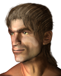
Of course, because of the resolution I'm working at, rotating, resizing, and whatever-ing things distorts certain features. I go back and do a little tweaking and repainting here and there, to make sure things still look good. Nothing major though, and even taking that into consideration, it's still much faster than having to paint those little tufts from scratch. For now though, we're done with the hair. We'll go back to it later though, but for now, we go back to other features.
Step 09 - Fix the face[edit]
The face can be really tricky. People expect certain features to show up at certain proportions, and anything different from that may make people feel that there's something wrong with the picture even though they won't be able to pinpoint exactly what it is. That said though, a few tweaks will need to be made in order for them to survive the scaling down process. Particularly, the eyes.
Generally, no matter what stock you're using, the eyes will always wind up being far too small once scaled down to 64×80 (or at least, such was the case in my experience) so you'll need to blow them up before scaling. Check out the example below:

The difference is very subtle, but in the image on the left, the eyes have been enlarged just a tiny bit. It's not much, but it does give you a couple extra pixels or so to work with, and as anyone who's done a lot of pixelling will tell you, there's a whole lot you can do with two or three pixels.
Step 10 - Start adding features[edit]
Now, I start adding other facial features. Probably most prominent is the large scar running down the left side of the NPC's face. Different people have different painting techniques for this, so go ahead and use the one that works best for you. Take note though, that you don't need to make it look absolutely perfect, and at this stage, it doesn't matter if things are still rough. You'll be refining them later.

Ok, granted, it's not the best-looking at the stage, but it'll work well enough for our purposes once it's scaled down. Even now, actually, it'll look pretty good once scaled down, take a look:

What was an ugly, unrealistic-looking blotch on the character's face looks like a much tighter, more realistic-looking scar once scaled down. This is pretty much the case with a bunch of other features, a lot of things need to be exaggerated in the scaled-up version in order to appear once scaled-down. Anywho, on to the next step.
Step 11 - Start adding in the stubble[edit]
Unlike with the hair, I'm not going to lay down any flats for the stubble. That's because with the hair, the flats served as a sort of base for the strands. It would certainly have been possible to paint the hair using the strands method I used, but that would have taken far too long and would have left far too many gaps between the strands. By using a flat color with the hair, I was able to simulate a greater thickness of the hair with less effort. With the stubble though, I don't need depth or thickness, as it's supposed to be a rough growth while still having flesh visible beneath it.
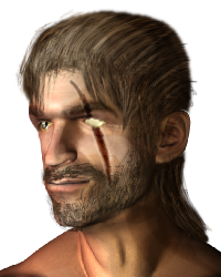
Of course, that doesn't look too good alone, so I go on and adjust the flesh beneath to look darker.
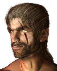
Much better.
Step 12 - Give the poor man some clothes[edit]
Currently, the poor guy has been sitting around for the past hour and a half (well, I'm doing the portrait while writing this article, of course it's going to take much longer) without a shirt. It's time he was given one. Use whatever method you prefer to paint a shirt in. Granted, I could go and find a stock image of a shirt or render one, but as my portraits don't really show that much below the chin, it's easier to just paint a rudimentary shirt and use that. It won't really show up, and it's simple enough to paint one that looks convincing at lower resolutions.

And here's the finished piece with clothes:
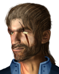
Step 13 - Last-minute shading[edit]
Now, we're almost ready to resize. Before doing that though, go on and fix whatever shading needs to be done, and add any other details you feel are needed. In this case, I've shaded beneath the collar to provide some shadow, and I've tied his hair back.

And now, we're ready to scale down.
Step 14 - Scale down[edit]
And now, the moment of truth, scale that portrait down. (Note, from this point on, I'll be blowing up the images to make the details more visible. They'll be scaled up to 2×, so the images that will appear on this board are 128×160, even though I'll be working on them at 64×80)
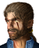
It's immediately evident that there are some problems. He looks like he's grinning, the beard seems a bit too dark, the nose isn't defined well enough, and his right eye has lost the pupil. Before moving on, fix what you can here, to make the conversion to 256 colors easier.

There we go, better. Not by much, but it'll certainly do for now. One final step, is to flatten the image, and adjust the levels to make the conversion go more smoothly.
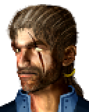
Done, now to reduce everything to 256 colors.
Step 15 - Reduce your colors[edit]
Now, you're ready to step into the pixel-ing stage. Go ahead and reduce your colors to whatever master palette you're using.

Cripes, that doesn't look quite that good. To get it looking better, you've got to go in and pixel-art things just how you want them. Now, as this isn't a pixel-art step-by-step (like the balrog and the cyclops), I won't go into every step I take here. Instead, here's a lovely little gif for you to watch.
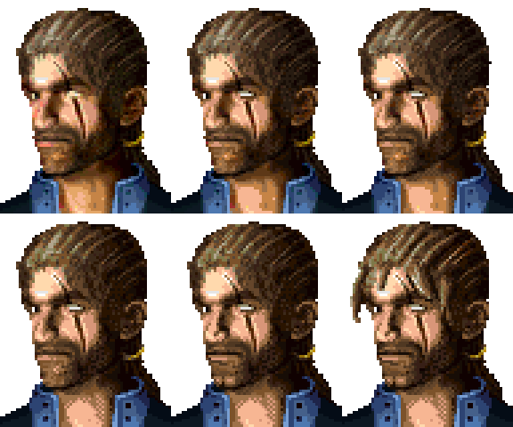
At this stage, you should be perfecting everything and pixeling the tiny little details into place. Everything above was a shortcut to get to this stage, but there's still no real replacement for hard work when it comes to pixel art. Granted, you've skipped a lot of steps (traditional pixel-art steps, that is) to get to this stage, but you're still going to need to get down and dirty at this stage.
And here's the finished product of pixel-ing:

Step 16 - Frame it[edit]
Now, I could certainly do a lot more with this portrait, but as it stands, he's a minor NPC, and doesn't serve that much plot-wise. I'll certainly spend more time on more important NPCs, but for this guy, that's all I'll be doing. Here he is, framed, and ready to be load backdrop sprite-ed, set parent sliced, and all that jazz that enables me to use lovely 64×80 portraits at 32 colors each instead of the default ones. That's all from me for now, I hope this is of some help to anyone looking for a way to do portraits!
