BMR's Step-by-Step Cyclops
Cyclops Step-by-Step[edit]
And here we have a step-by-step guide detailing how I went and made a cyclops. This is not a be-all-end-all thing, but rather just a simple example of one method to go about making sprites. So without any further ado, let's get started!
Step 1 - Initial Drawing[edit]
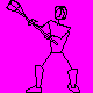
As with the balrog, I start out with a basic sketch of the figure. Here, as the figure is more humanoid, I went with a rough skeleton. The arms are simple lines as at this point, I have no need for figuring out where the muscles are. All I need at this point is the flow of the limbs. The body though, is a rectangle(ish) as I use the placement of the shoulders and the alignment of the sides as a guide showing me where the body is facing. This helps in placing the rest of the skeleton and figuring out if the placement of the arms is weird.
The legs are also mostly done as simple lines. I have made the lower legs more filled in though. With the arms, as they end in fists which are effectively just little circles at this point, I don't need more than lines. With the lower legs though, I need to know where the calf muscles are and which direction the feet are pointing so I've gone ahead and drawn them out here.
At this stage, if you're really good, you can just draw it off the top of your head. If you're like me and aren't really good, then it can be useful to look at a reference. If you can get one of the wooden mannequins, then they're rather useful in my opinion. I've yet to get my hands on one, so in the meantime I search for public domain stock to give me an idea as to the pose. Failing that, I boot up into Windows to use Poser so I can style the pose however I want.
Step 2 - Fill In Drawing[edit]
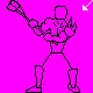
In this step, I've begun fleshing out the body by adding muscles and filling things out. I've also added the light direction arrow way ahead of time.
At this point, I go ahead and refine the skeleton if I find anything I need to change. When pixeling this cyclops, I realized at this step that while the flow of the skeleton looked fine, it didn't leave any space for the muscles. Further, if I were to foreshorten the arm or if I were to leave it as it is, it would look as if the cyclops were holding the club out from his body, hardly the effect I want. I want him to be holding the weapon at ready, all set to bash anything that comes into view. To do this, I lowered the elbow and adjusted the placement of the shoulder. Now, it looks more like he's bringing it to bear.
I've also started adding a few details, like the shoulder guard thingy with spikes on it. I could have done this at a later stage, but as I'm a lazy bugger I went ahead and did it now so that I wouldn't have to draw the shoulder and upper arm area. I take back the thing about being lazy, it's not [i]laziness[/i], it's a time-saving technique.
Step 3 - Continue Filling In Drawing[edit]
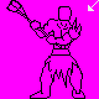
Here, I've continued filling in the muscles and stuff. I've also drawn out the basic form of the loincloth and the belt holding it up. The upper body hasn't changed much, just filled in the gap in the side of the cyclops' head.
Step 4 - Refine Drawing[edit]
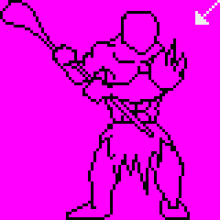
After drawing the legs, it was painfully obvious how out of proportion the legs were to the rest of the body. Now, I hard two choices, I could either redraw the legs to fit the body, or buff the body up to fit the legs. As this cyclops is supposed to be a tank and a brawler, I opted for the second option. To do that, I too my marquee and split him in half at the middle. The left and right halves were shifted a few pixels apart and then the space in between was redrawn.
This had the added benefit of giving me more space on the body to add some more detail, like the abdominal muscles. It also provided me with an opportunity to extend the haft of the club to give it a slightly more realistic length.
Another thing I've done at this step is to add slabs of muscle to his neck area. As it was in the previous step, it looked too much like he was standing upright. I want him to be a hulking behemoth, so I added the thick muscles at the neck area to make it look as if he was slouching and hunched over.
Step 5 - Color Flats[edit]
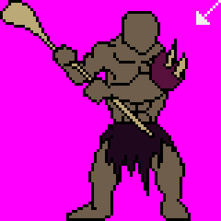
This is a fairly simple step, like the balrog, I've simply filled in all of the flats here. I've tried to keep the color count low, so you'll notice that the spikes on the shoulder guard and the club use the same color. They'll be shaded differently later, so it shouldn't be too obvious that they started out the same shade.
Step 6 - Add Shadows[edit]

Using my lighting guide (the little arrow at the top), I start adding shading here. If you're not too sure about how and where the shadows should fall, then looking at a reference might help. Alternatively, find something of similar proportions and shape (an action figure or something might help) and shine a flashlight onto it to see how the light plays out.
Step 7 - Continue Adding Shadows[edit]

In this step, I've added shadows to the shoulder guard and to the club. Again, I'm conserving colors, so the shadow of the club is the same color as the base flesh of the cyclops. The shadow of the shoulder guard is the same color as the loincloth.
Step 8 - Add Highlights[edit]

Now to add the highlights. It's the same concept as with the shadows, so nothing much to say here. You'll notice though, that the shoulder guard is shaded/highlighted differently from the rest of the flesh. I did this to remind myself and to provide a visual showing that it's of a different material.
Step 9 - Blend Colors[edit]
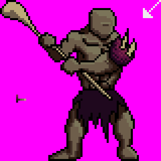
Here I've started to blend the shadows together with the rest of the flesh. I've also changed the shading on the head to give the cyclops only one eye, as in my stupidity I previously shaded for two eyes.
Step 10 - Begin Adding Details[edit]
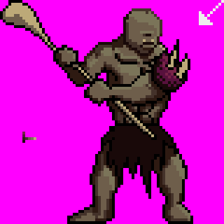
I continue shading here and I also begin to add some details, particularly in the head area. I've also started to do away with the solid black outlines in favor of colored ones.
Step 11 - Continue Detailing[edit]
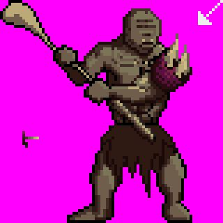
More detail here, and more removing of black outlines. I've changed the color of the loincloth as the previous color wasn't working as well as I hoped it would. I've also added wrinkles on the forehead which in retrospect don't look quite as good as I'd hoped. The spikes have also been extended and de-outlined.
The bottom half of the club has been de-outlined and blended. This part was particularly tricky, and one of the reasons that I changed the color of the loincloth. It wasn't working well with the staff, and I needed different shades that wouldn't have worked. So the loincloth got lighter to provide me with the opportunity to add shadows to it.
This will happen often actually, and you should keep in mind that just because you've already set a color down doesn't mean you can't change it later on if you find it's not working or if something else will work better.
Step 12 - Continue Detailing Some More[edit]
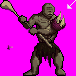
I continue detailing here. The arm has also received a few changes around the bicep area. I've begun de-outlining the chest and shading it. The major change here though is the loincloth, which I've begun to texture and shade as if it were made of fur. I'll admit that the colors could have been a bit more distinct though, a fact I've only just noticed now that I'm writing this.
Step 13 - Refine Structure[edit]

The left hand has been redrawn to make it look more like he's holding the club. Previously, the center of the grip wasn't in proper place to be holding the haft of the club. More shading has also been done to the hand to give it a more rounded look.
Step 14 - More Detailing[edit]
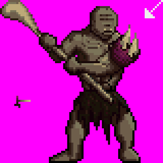
The rest of the club has been de-outlined and shaded. It blends in a bit too much now, but it'll be fixed later on.
Step 15 - Adjust Framing[edit]
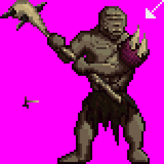
I completely forgot that I wanted to add spikes to the head of the club. It was a good thing then that there was a bunch of extra space on the right. I shifted the entire thing a few pixels to the right and added the spikes to the head of the club. I haven't added any new colors here. The spikes are made up of grays from the loincloth and highlights from the spikes.
Step 16 - Begin Texturing[edit]
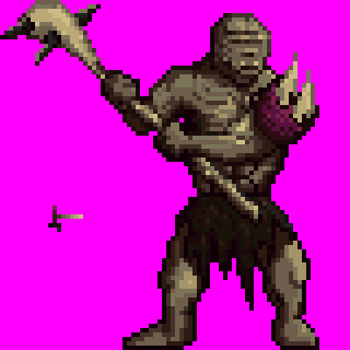
Basic colors are done, so I begin texturing here to give the flesh a worn, rugged, and leathery look.
Step 17 - Refine Texturing[edit]
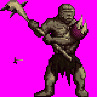
More texturing here and even more de-outlining. At this point, I think I have no more black. It does make the figure a bit indistinct though, so I refine the edges to make it so that the sprite still stands out.
Step 18 - Refine Shading/Texturing[edit]
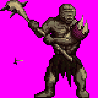
Again, more texturing and refining of shading. I should have realized long before point that the eye was no longer visible. Being the klutz i am though, I didn't notice until much later.
Step 19 - Finish Up Texturing[edit]
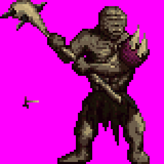
I finish up the texturing here. In retrospect, there are parts of it that are a bit too textured. Easily remedied though, and I probably will in the future.
Step 20 - Add Finishing Touches[edit]

And now he gets his eye back. His jaw was also restructured to allow for longer tusks. The spikes on the shoulder guard have been lengthened to unrealistic and silly lengths, but hey, I like the look, so it stays.
And that's it for this cyclops. Again, I hope this is of some use to people.
Cheers!