Beginning Pixels - All About Colors
Beginning Pixels - All About Colors[edit]
This is a short little article aimed at complete beginners to pixel art and art in general. This guide will not cover any specific techniques. Rather, it's about common terms, concepts, and theories that are relatively common to digital art, particularly with colors. I repeat, we will not be talking about any specifics about how to draw lines, blending techniques, etc... This is all just pure theory and stuff.
Now, that aside, let's get started.
I. Colors on Your Screen[edit]
Now, seeing as how you're on your computer now, you're probably aware that your monitor shows you colors. That goes without saying. It is, however, important to mention just how your computer gets those colors from your monitor to your eyes. Your monitor, along with pretty much all screens, represent color through mixing light (additive color). Books, pictures, posters, etc... however, display color through mixing pigments (subtractive color). The difference lies mainly in how the colors mix and the "primary" colors used. With additive colors, the colors red, green, and blue are used, hence the term, RGB. Subtractive color however, uses cyan, magenta, and yellow, plus an additional key, hence CMYK. For pixel art (and all digital art) we're only going to be concerning ourselves with RGB.
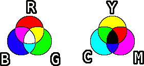
All monitors display colors in RGB, as they're using light to display colors. Each color thus has three values, each representing either Red, Green, or Blue. These numbers typically go anywhere from 0 to 255 (256 is a magic number, but exactly why is subject for another article and far beyond the scope of this one). Pure red would thus be something like (R 255, G 0, B 0). This is simplified by hex codes which most image manipulation programs use. Pure red would be FF0000, pure blue would be 0000FF, and so on.
Pretty much all the colors you'll ever need can be displayed using this system. Now, while it's not exactly vital to know this, it's still good to have at least a basic grasp of the basics and how these colors work on your computer. Also, we'll be using some of these concepts later on, so best to get them out of the way now before moving on.
Now that that's done, let's move on to more interesting things.
II. Hue, Saturation, and Lightness[edit]
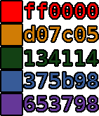
Now, you'd think the colors would be simple. Red is red and blue is blue. Then you've got lighter and darker colors. All the colors below, for example, are all different shades of red.

Sure, that's true, for the most part, but there's a whole lot more going on than that. In this segment, we're going to talk about Hue, Saturation, and Lightness. In a nutshell, they are defined as follows:
[list] [*]Hue - The values of Red, Green, or Blue. Basically, the color of that particular shade. [*]Saturation - The intensity of a color or how much color there is in that particular shade. [*]Lightness - The lightness or brightness of a color. How light or dark a color is. [/list]
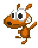
Let's take a closer look at those three. With the following, we'll be using Bob the Hamster to illustrate the differences in the three values. For reference, here's an unaltered (well, altered a bit, he's enlarged 500%) picture of Bob.
IIa. Hue[edit]
Hue is simply what color a "color" is. It describes the RGB values and how much of each (Red, Green, or Blue) are in a specific color. When an image changes in hue then, it means that it's changing in color. For example, this image of Bob the Hamster is shifting in hue.

This can be useful with certain types of graphics, as a simple shift in hue can potentially get you a new sprite. Changing the colors of a sprite and exchanging them for another set of colors is called a palette swap. Now, palette swaps are more than just changes in hue though. Other values such as saturation or lightness can also change, but often simply changing the hue will quickly yield results.
Take the guard sprites below. Without changing saturation or lightness, the original blue-caped version has been altered into three "new" sprites.

It's a simple technique, but it can potentially save hours of work when doing pixel art. Add in changes to saturation and lightness (coming up next) and you've got a lot of time-saving skills at hand.
IIb. Saturation[edit]
Think of a color as a dye of sorts. Saturation then is how much of that dye you put into a color. Low saturation red will look rather washed out, whereas high saturation red will appear rather vibrant. In a word, saturation is the intensity of a color. Let's look at Bob again to see the changes in saturation.
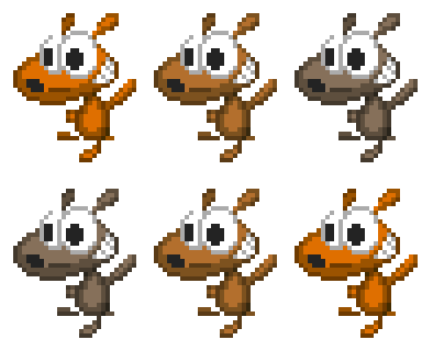
As you can see, when at low saturation, Bob becomes all gray. The closer a color is to grayscale, the lower its saturation. A common newbie mistake is to use high saturation colors all the time. While this might work in a few cases, it's generally not a good idea as few things are always at maximum saturation. Take this tree for example:
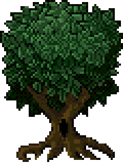
It has subdued colors, nothing too glaring or in-your-face. It looks like a tree. Now, when the saturation of all the different colors is pumped up to max though:
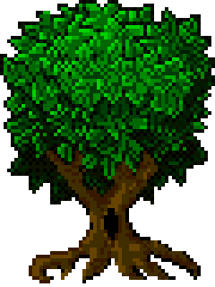
The top part of the tree looks almost as if it's glowing. You've got all sorts of bright colors that you won't typically see in nature. It still looks like a tree, and it still somewhat looks good, but if your entire game is full of colors all pumped up to maximum saturation, you're probably going to give your player a headache.
IIc. Lightness[edit]
Lightness is perhaps the easiest to understand. It's simply how light or dark an image is in terms of brightness. Bob will display shifts in brightness.
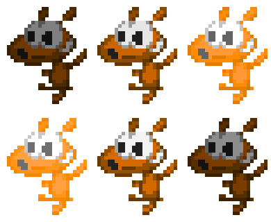
This is perhaps a lot closer to what one would think of "dark" or "light" colors. It's worth mentioning though that simply changing the lightness of a color is often not sufficient to represent a specific color being brighter than others. Rather, it's a combination of the three which will best display this. But that's for another article at another time.
And that's all for this article, I hope that you're able to take away something from this. With luck, I'll have another article some time soon.
BMR out!
See Also[edit]
- Next article in series: Beginning Pixels - Color Ramps
- This article on Slime Salad