Slice Collection Editor Tutorial
Slice Collection Editor - Making a HUD:[edit]
First dealing with slices can be a daunting task. As a plotscripting tool, they are abstract and complex. However, slices are in reality a very concrete and visible element of every OHRRPGCE game. Almost anything drawn on the screen is a slice (or collection of slices): heroes, map layers, NPCs, etc.
Thankfully, you don’t have to manipulate slices using code alone. The Slice Collection Editor provides a visual editor where you can create and manipulate slices, all while immediately seeing your changes. This tutorial will demonstrate one method of arranging a simple, static HUD for a game, then how to implement the HUD in-game using a one-line plotscript.
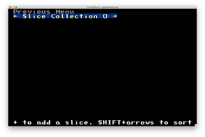
First off, open a new rpg file in Custom and navigate to the “Slice Collection Editor” from the main menu. You will be presented with a view like this.
Once in the editor, press + to create a new slice. For our purposes, choose “Rectangle”
Pro Tip |
 |
|
There are multiple types of slices. Each has a specific behavior useful in different situations, but all share a few attributes. Every slice has an x,y position on the screen, a width, a height, a visibility value, and a lookup code. Sometimes these attributes will be hidden or un-editable, but they are still defined on the slice. |
|
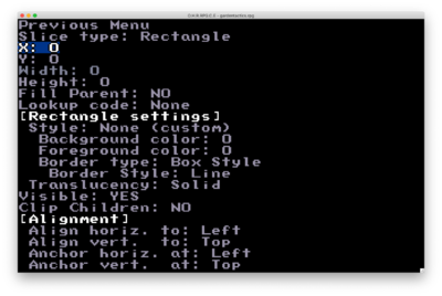
Now you will see a new slice, labeled “Rectangle,” in the slice hierarchy. Select the rectangle with space or enter. You can then view its attributes.
Notice the rectangle’s x, y, width, and height are all 0. This means the rectangle is taking up 0x0 pixels on the screen and is positioned in the top left. Adjust the X value to 200, the Y value to 50, and the width and height to 100 and 40, respectively. Now the rectangle is actually within view and large enough to see.
But alas! The rectangle is still just a dotted outline. Let’s give it some style in [Rectangle settings].
Now that the background color and border style have been set, the rectangle has some visuals.
Pro Tip |
 |
|
The foreground color is the color of the 1-pixel-wide border around the rectangle. It is not visible in the current example, because the Border Style has been set to an image. If you would like to see the foreground color, set Border Style to “line.” |
|
Next, we’ll add 3 elements to this box: a name, a class, and a sprite inside a circle. Create a new slice, this time, an “Ellipse” slice. The new slice will appear above the existing Rectangle.
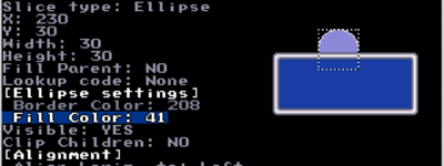
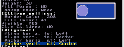
Set X to 230, Y to 30, and the width and height of the Ellipse to 30 and 30. Now set the Border and Fill Colors to any non-zero value. Your Ellipse should appear as below.
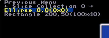
We want this ellipse to appear inside of the rectangle, however. Right now it’s being drawn behind the rectangle, because the ellipse is listed before the rectangle in the slice hierarchy. After editing the attributes of the ellipse, return to the previous menu.
Use the arrow keys to select the ellipse if it’s not selected already. Hold shift, then use the arrow keys to move the ellipse below the rectangle in the hierarchy. You should see the changes as below. The ellipse is now drawn in front of the rectangle.
We can go even farther, though. Since we want this ellipse to always appear inside this rectangle, we will set it as a child slice of the rectangle. To set the ellipse as a child of the rectangle, hold Shift, then press the Right Arrow while the ellipse is selected in the hierarchy. The slice hierarchy will show the ellipse as indented below the rectangle. Indentation in the hierarchy will inform you of which slice is a child of which. Slices with the same indentation are “sibling” slices (eg. they have the same parent).
Edit the ellipse to see its coordinates have changed. Before it was a child of the rectangle, it was at X: 230 and Y: 30 as we had set it. However, now its X and Y positions are relative to its parent slice. Set both X and Y to 0.
Now, the ellipse is in the top left corner of the rectangle. In other words, the slice is 0 pixels to the right of its parent’s origin, and 0 pixels down from its parent’s origin.
This design isn’t very clean, though. The ellipse should look much better if it’s vertically centered. We can accomplish this by setting both “Align vert. to:” and “Anchor vert. to:” to “Center.” These attributes are labeled under [Alignment].
Pro Tip |
 |
|
Slices have [Alignment] attributes that inform them of their point of origin. By default, the horizontal alignment and anchor point are to the Left. The vertical alignment and anchor point default to Top. This means the Top-Left corner is a slice’s point of origin. |
|
Inside this ellipse, we will place the character sprite. Return to the slice hierarchy and press + again to create a new slice: this time a Sprite. Make sure to, using Shift+Arrow Keys, move the new sprite slice below and right of the ellipse to make the sprite a child of the ellipse. This character sprite should always appear in the dead center of the ellipse, and making it a child is the quickest way to accomplish that.
Your hierarchy should now look like this!
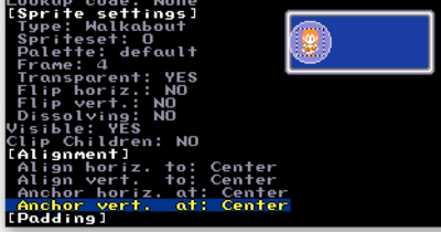
Edit the sprite and set the Type to “Walkabout.” This attribute can be found under [Sprite settings]. Reset the X and Y position to 0 if it has changed due to the resizing caused by changing the sprite type.
Set the Frame to 4, so the sprite is facing us. Then, set all of its Align and Anchor values to “Center” to center the sprite completely in the ellipse.
Pro Tip |
 |
|
If you would like to use your own sprites, these attributes under [Sprite settings] are those which you would edit. For the tutorial’s purposes, it will be clearest to save adding your own sprites until the end, however. All you need to do is edit this sprite once again. |
|
Now it’s time to add some text! Back in the slice hierarchy, press + to create a new text slice. Use Shift+Arrow Keys to make sure it’s a sibling slice of the ellipse. It can be listed before or after; It doesn’t matter much, since we don’t want these slices to overlap anyway. Set its X and Y position to 0 if necessary.
Type into the Text attribute to change the text. I named the character Francine.
The name is on the left side of the rectangle, interfering with the sprite, so let’s edit its Horizontal Align and Anchor to Right. Return to the slice hierarchy, and edit the rectangle. Below the alignment attributes is the [Padding] section. Set the padding of the rectangle to 4 in all fields: top, right, bottom, left.
Pro Tip |
 |
|
Padding adds space between the edges of a slice and its children within. For example, if you set a parent slice’s left padding to 3, a child slice with x=0 would appear 3 pixels to the right of the parent slice’s left edge. |
|
With the current width of the rectangle, there isn’t quite enough space to fit the name Francine next to the sprite. Let’s fix this by editing the rectangle itself. By increasing the width by 6 (total 106), we free up enough space to fit the ellipse and the text side by side.
Note that because we had the alignment of the text set to Right already, we don’t have to edit the x,y position of the text at all. It falls right where we want it to relative to the rectangle. If alignment is still confusing, try to think about it like left/right/center justification in a word processor.
To finish this HUD element, let’s add a class name!
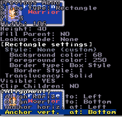
Back in the slice hierarchy, use the arrow keys to select/hover over the “Francine” text slice. Press Ctrl+C then Ctrl+V to copy and then paste the slice. You’ll notice a new slice in the hierarchy, but won’t see anything new. This is because the duplicated slice is perfectly overlapping with the original. Edit this new text slice. After moving the Y position down 10 pixels, changing the text to “Warrior,” and changing the text color to a calm red (color 89), this is how it looks.
And there is our character! Move the rectangle containing the name, class, and sprite to position X:3, y:3 to position the box in the top left corner.
Back in the slice hierarchy, Ctrl+C and Ctrl+V the rectangle to duplicate our character profile. On the new rectangle, you should see all of its children have been copied as well.
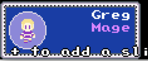
To be able to see the new profile, set the vertical Align and Anchor of the new rectangle to Bottom. This should position the profile in the bottom left corner. This profile should represent a new character, so let’s edit the name and class text to someone new. I named the new character Greg with a class of Mage. Then, edit the sprite (child of the ellipse slice). Set its Spriteset attribute to 1. The frame should remain at 4.
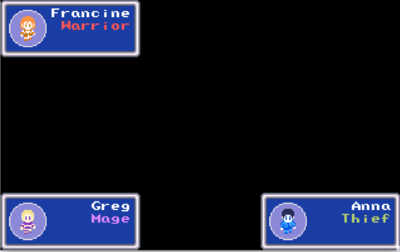
After these steps, we should have a second character profile in the HUD!
Repeat the previous steps one last time (copy and paste Greg’s profile rectangle) to create a 3rd character profile. Position the rectangle in the bottom right corner (Horizontal Align & Anchor: Right, Vertical Align & Anchor: Bottom). I named our 3rd character Anna and gave them the class Thief.
This is our final HUD. At this point, if you would like to make changes of your own to the slices, you are free to do so. This may include changing text, character or border sprites, and/or colors for the rectangles, ellipses, or text. Resizing elements may also help achieve your aesthetic goals. Now all that’s left is to load this slice collection while playing the game.
To keep this tutorial simple and about slice collections, the plotscript to implement this slice collection will be one line of code. It will load the slice collection when the game starts, and it will stay visible until you quit the game.
Open your text editor of choice, eg. Notepad++. I will call our plotscript “display hud.” In a new document type “plotscript, display hud, begin.” Make a new line, hit tab to indent, then type “load slice collection(0).” Make another new line, then type “end.” It should look like this.
The script command “load slice collection(id)” loads the collection to the slice tree, resulting in it being drawn every frame until deleted. It takes the number 0 as an argument, because that is the ID of the slice collection we were editing. Ensure the ID of your slice collection by entering the slice collection editor in Custom and viewing the ID here:
Note: while selecting “<- Slice Collection 0 ->” press the left and right arrows to navigate to other slice collections.
Pro Tip |
 |
|
Slice collections will be drawn on top of (in front of) everything except menus, and they will not display in battle or on the title screen. |
|
Save your file as a name you’ll remember, with the extension “.hss” For example, your file might be named “hudscript.hss”
Compile your script.
Navigate to the main menu in Custom, then select Script Management > Compile and/or Import scripts (.hss/.hs). In the file browser, locate hudscript.hss (or whatever you named your file) and press enter. Watch for compiler errors at this step. Anything as small as an extra parenthesis will cause the compiling step to fail.
Assign your script.
From the main menu in Custom, select Edit General Game Settings. Under the heading “Scripts” select Special Plotscripts… Using the left and right arrow keys, set "New game: hudscript" and "Load game: hudscript". Return to the main menu, then select Test Game to see if it’s worked!
At this point, if you have any problems, it is likely best to visit the Slime Salad forum or the Slime Salad Discord server to ask for help.
Moving On[edit]
Now that you have a HUD made, I'm sure you'd like to put it to use. To do that, we need to use plotscripting. That's a whole different process, so let's move to a different tutorial to cover it. If you're interested, Part 2 of this tutorial is found here: HUD Scripting Tutorial.
See Also[edit]
Getting Started | Making Maptiles | Making Walkabout Graphics | Importing Graphics | Map Construction | NPCs | Text Boxes | Tags | Making a Hero | Items | Shops | Customizing Menus | Battles | Stun, Regen, Poison, and Mute | Sound Effects | Animating Maptiles | Zones | Vehicles | Distributing a Game
Bosses | Making Complex Attacks | Combat Dialogues | Enemies that respond to a certain attack | Ways to refer to a hero in a script | Creating Dungeons | Conditional Door Links | Permanent Stat-Boosters | Creating Cutscenes | Using the Mouse in the Game | Making Android games
